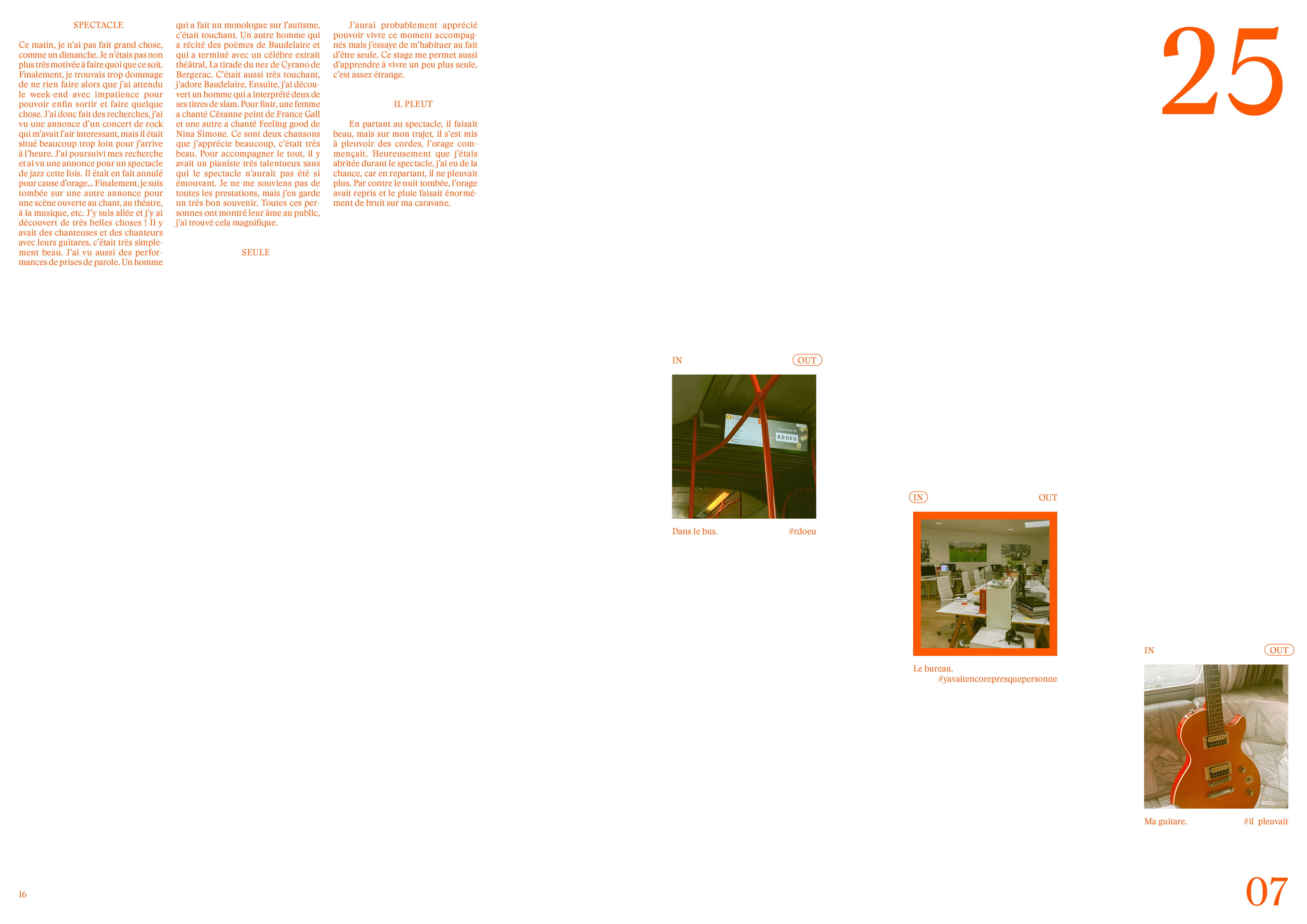
Typography
JUL 2024
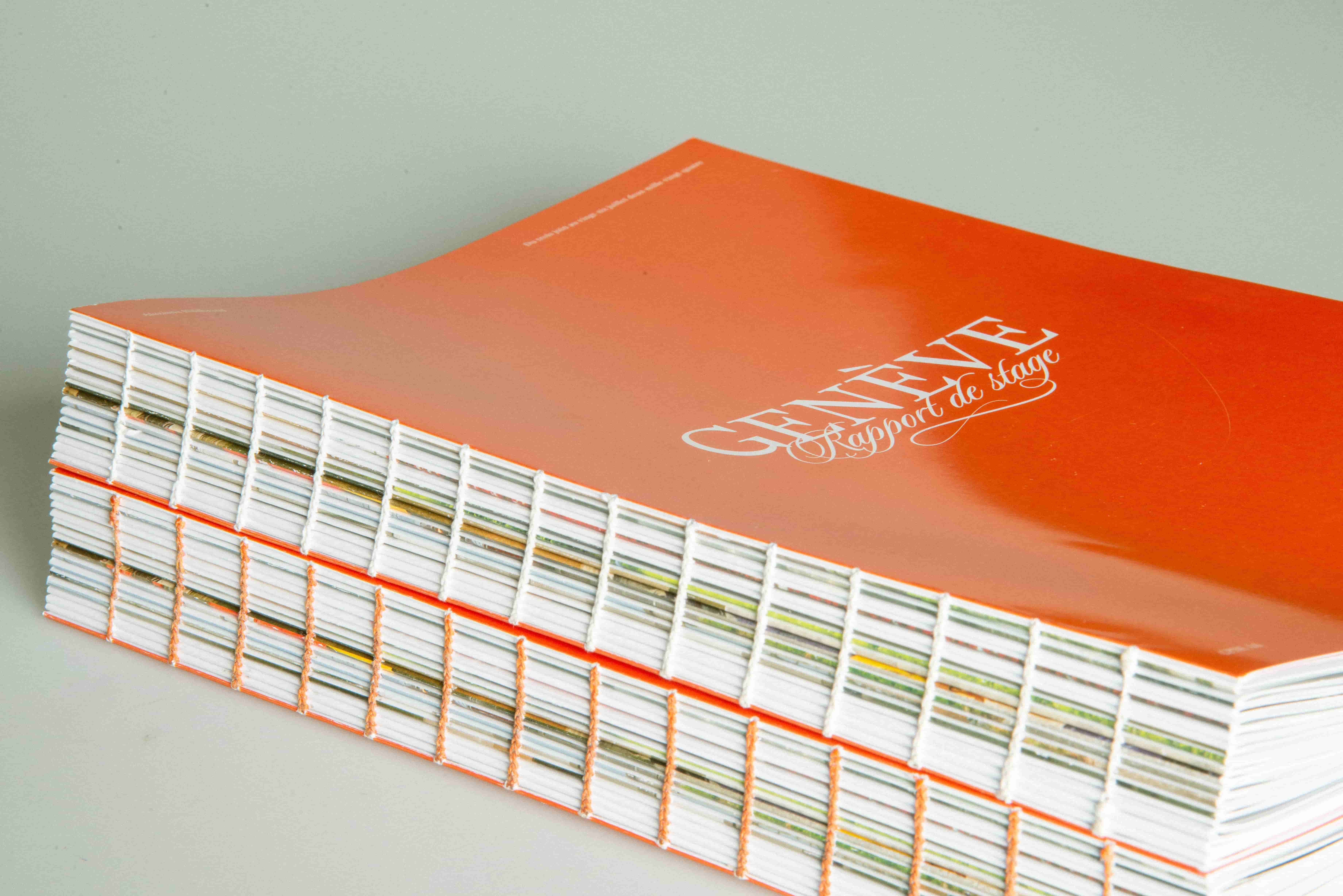
This chapter presents the internship report completed at the end of the third year of studies at the Applied Arts School (CPNE-AA). This two-month internship took place at Anthesis/Charlescannon in Geneva, a communication agency renowned for its work in graphic design and animation. The printed report is divided into a professional section (In), which explains the projects carried out within the company, and a more personal section (Out), which brings together weekly narratives reflecting on this life experience.
Graphic choices
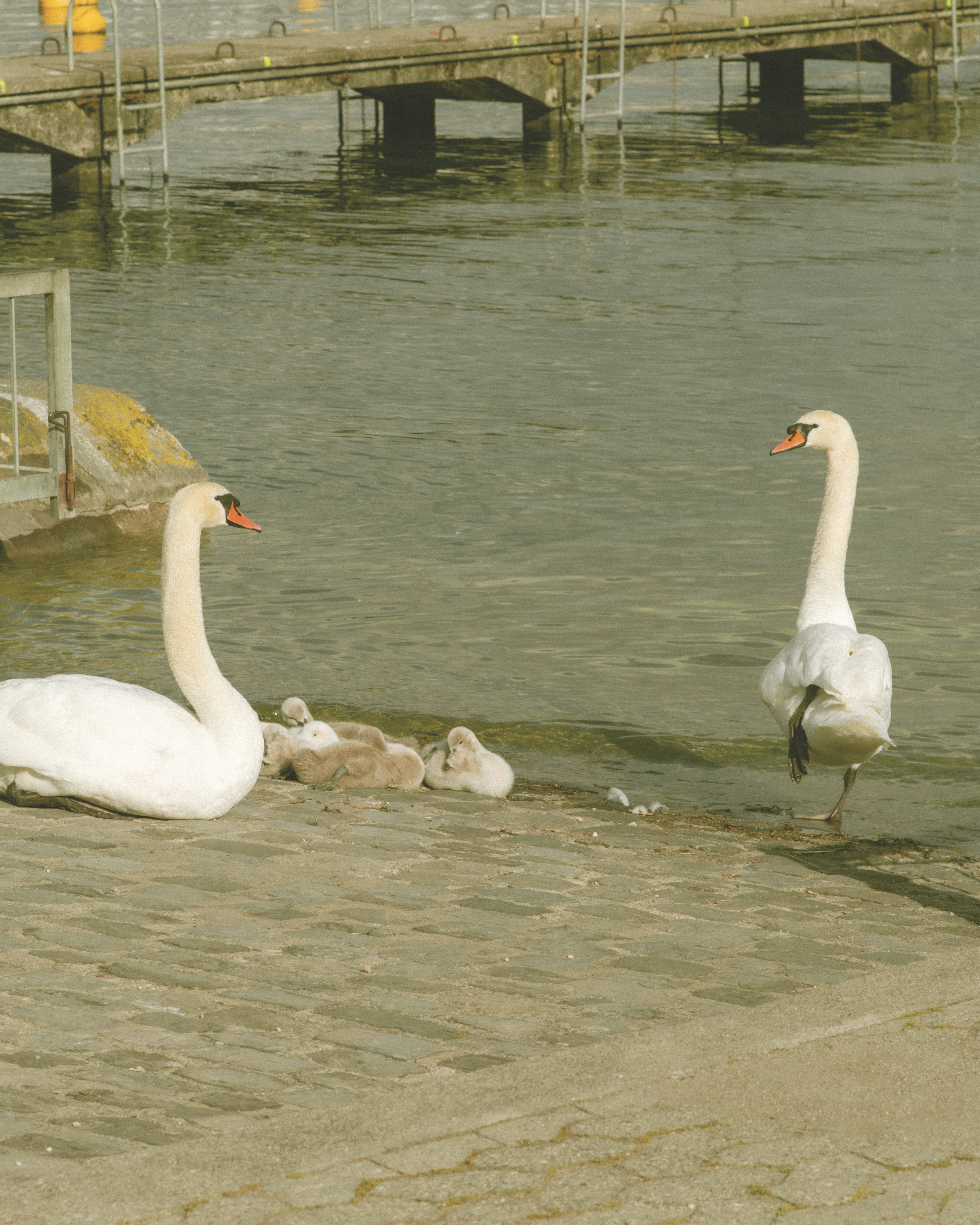
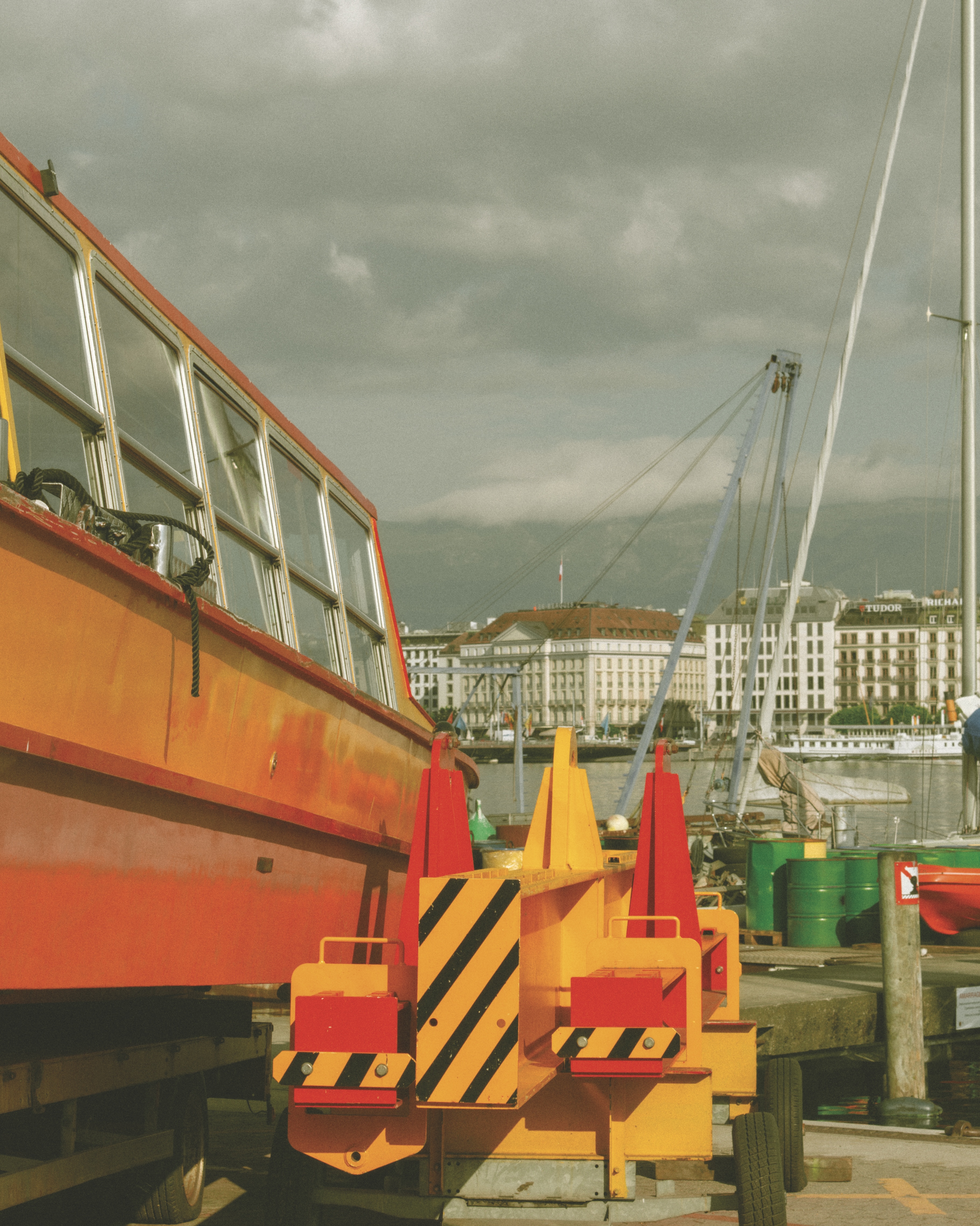
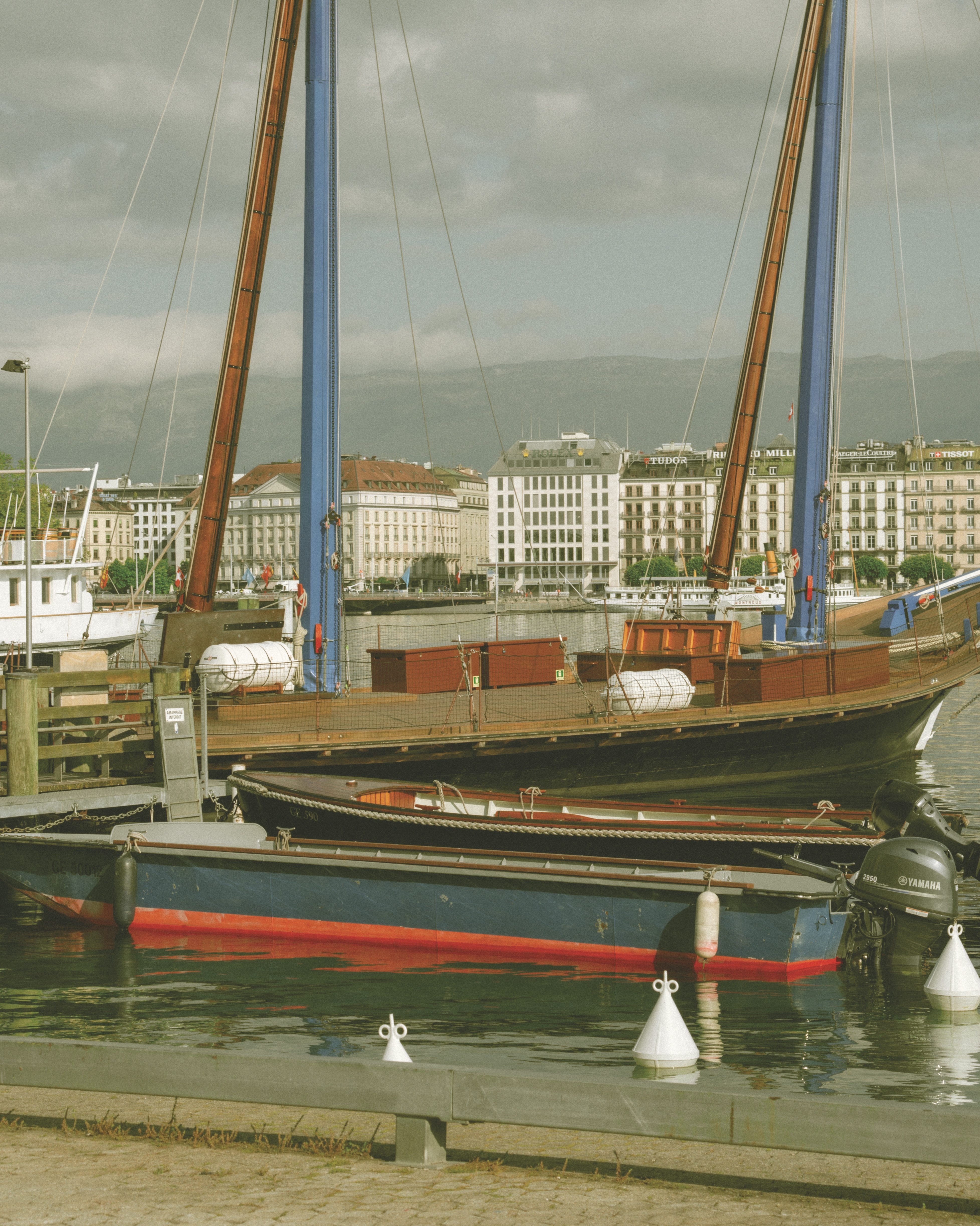
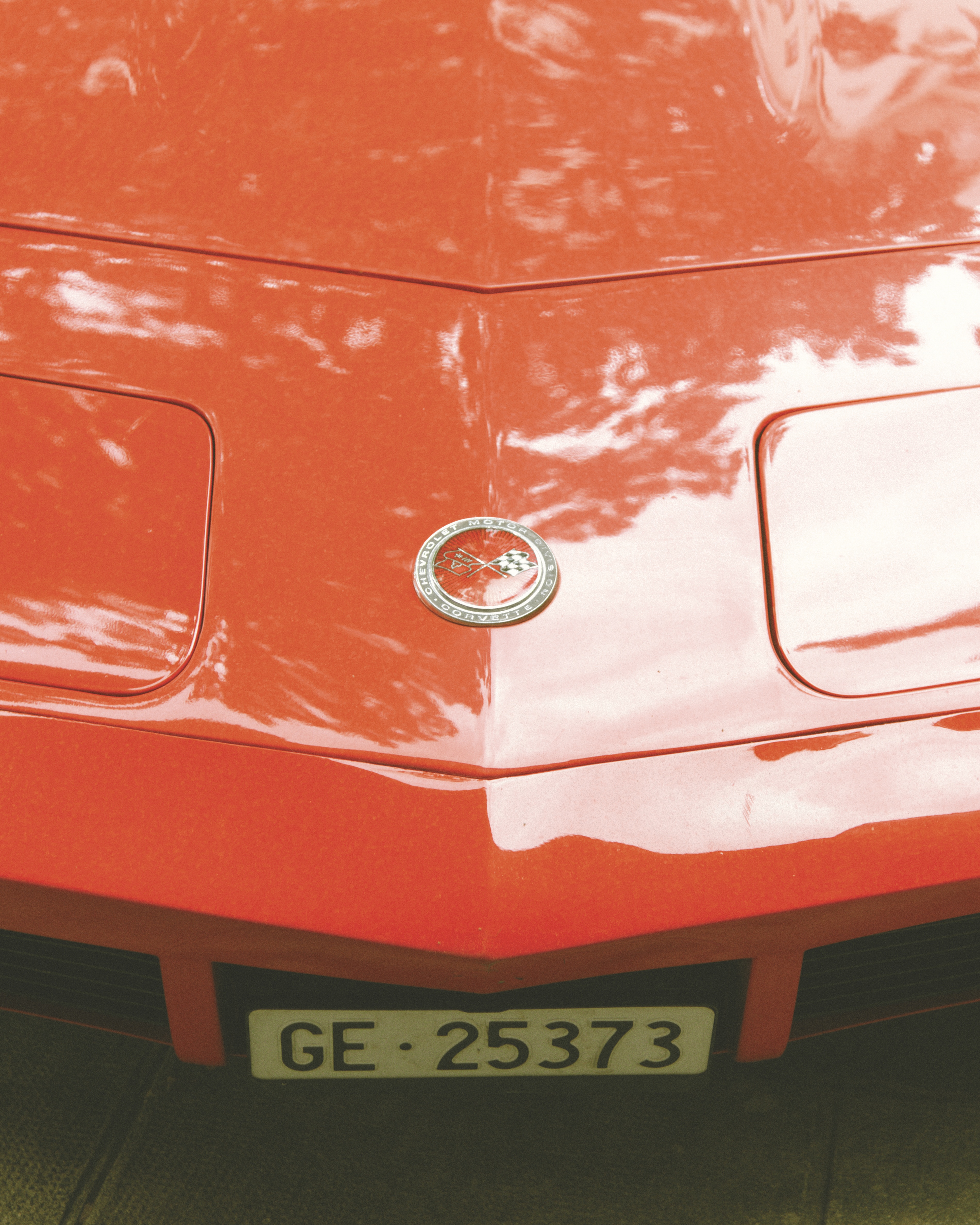
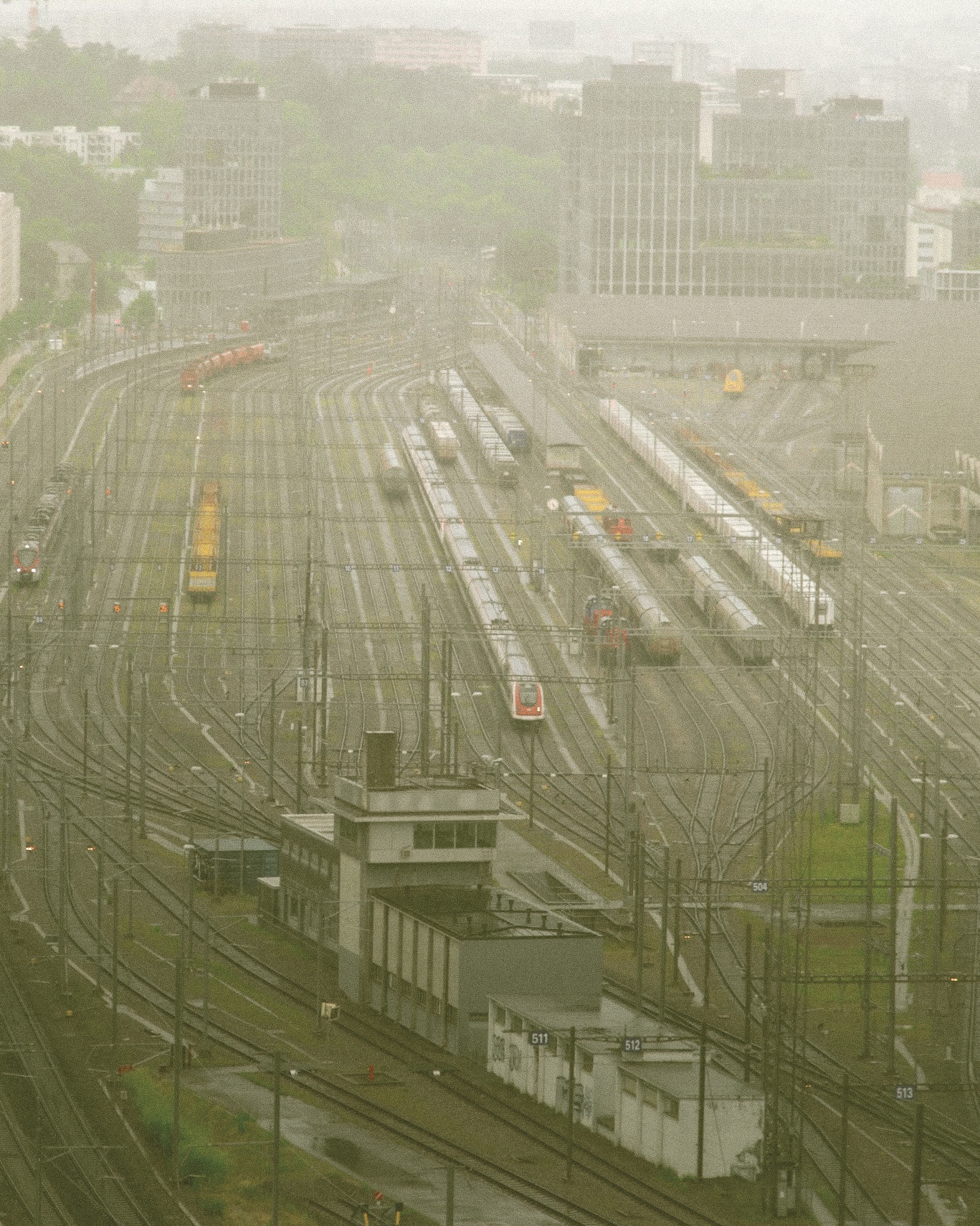
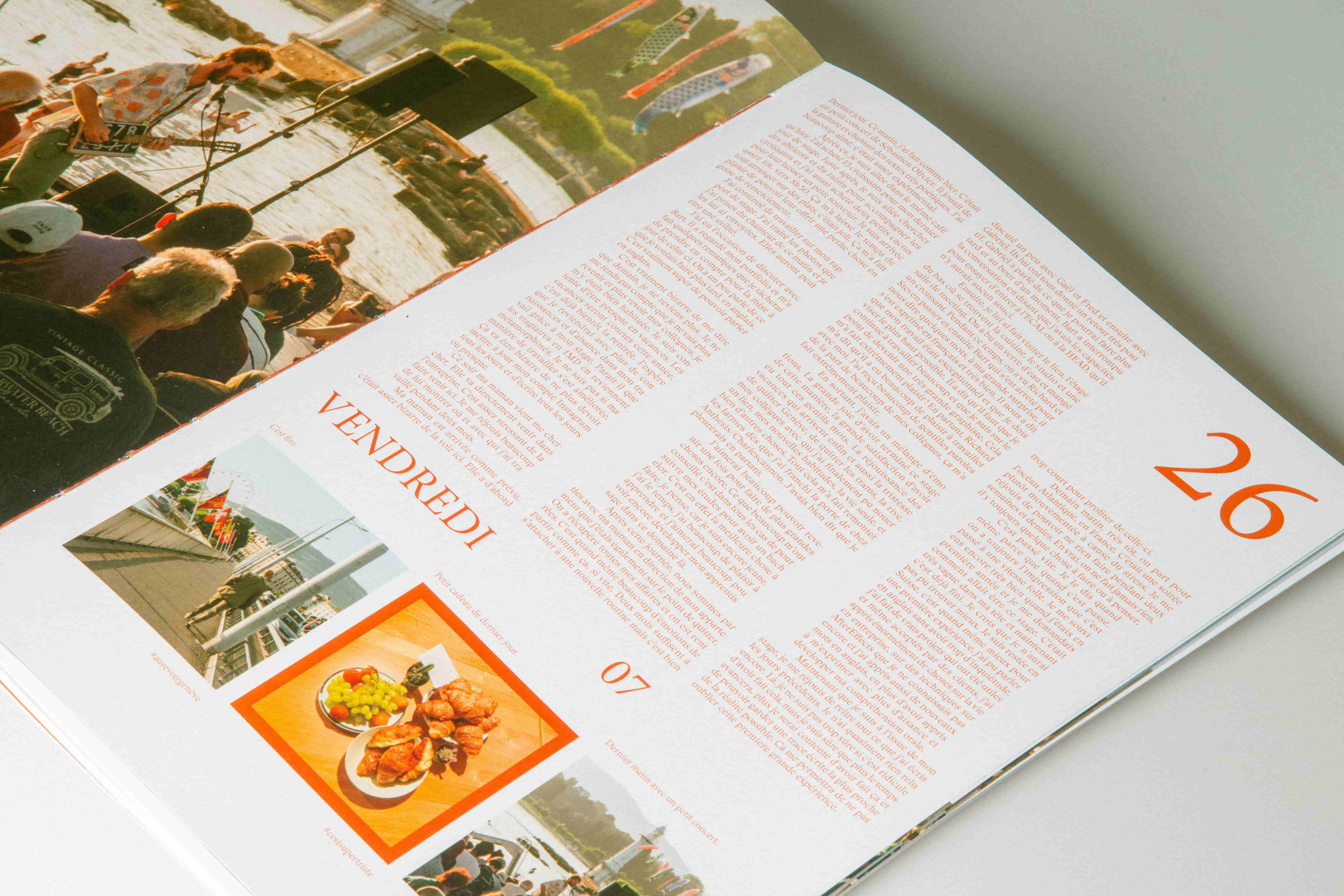
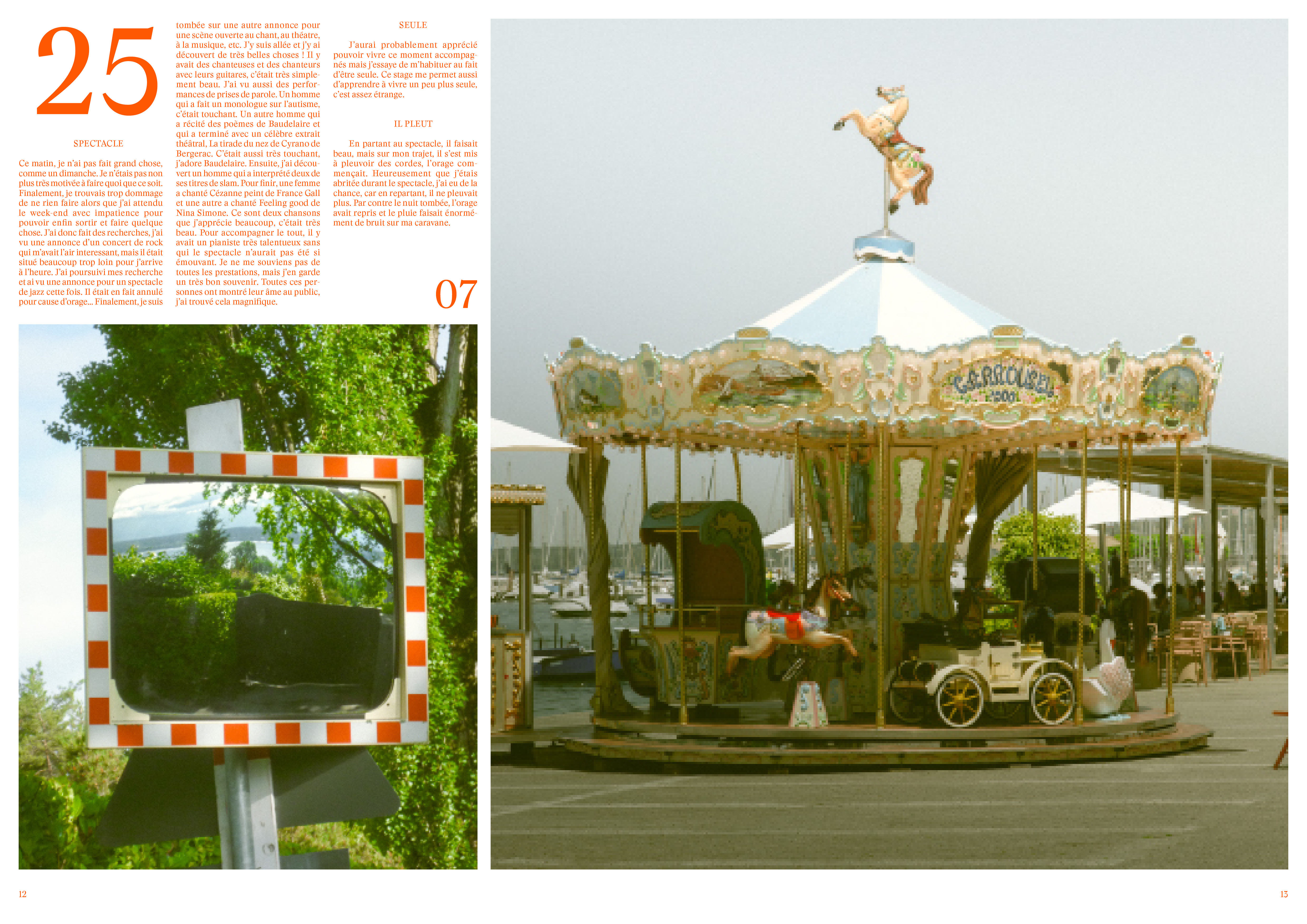
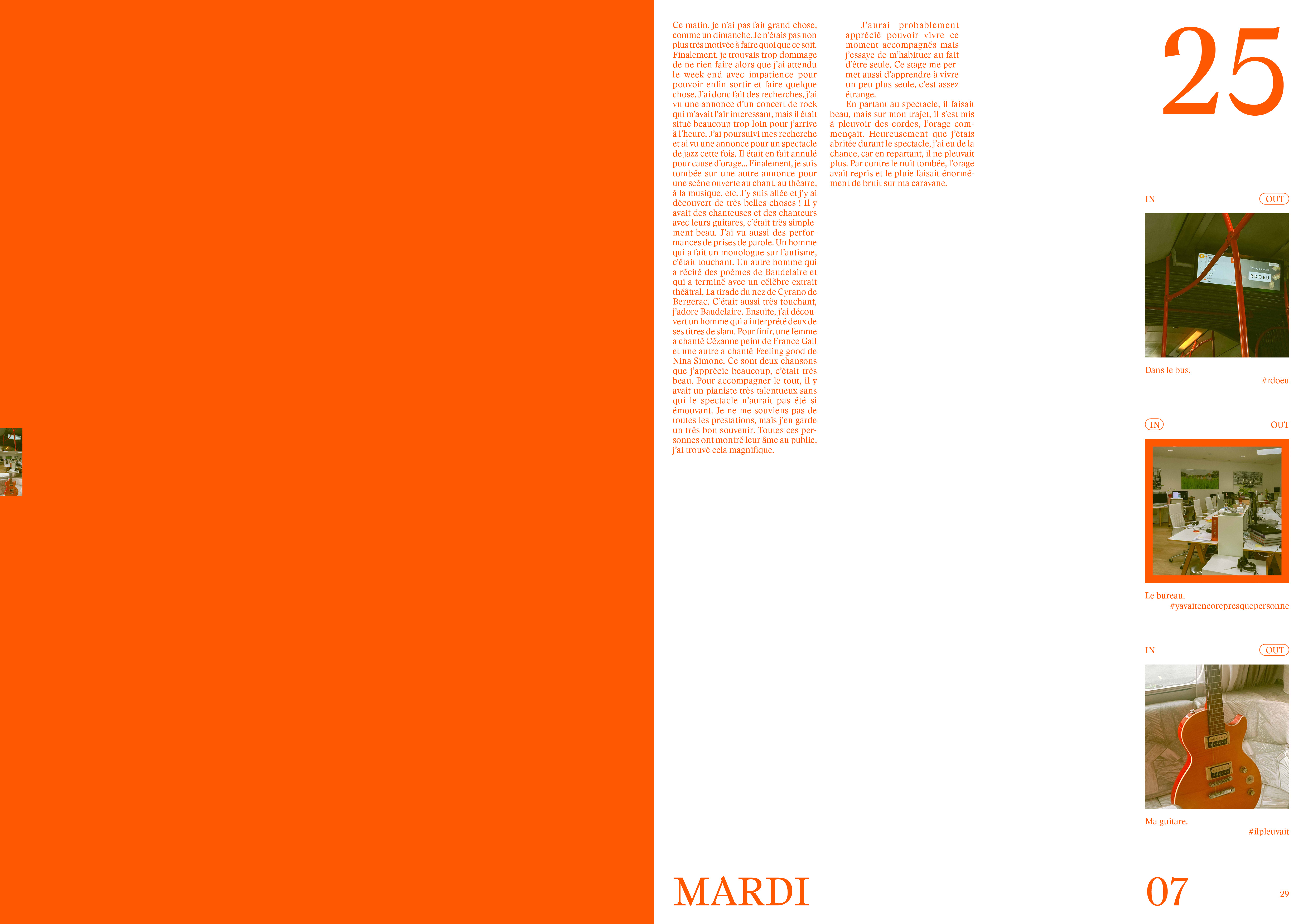
The bright red-orange color evokes the summer period during which this internship took place, as well as the unique nature of this experience. The distinction between the “In” and “Out” sections is emphasized through the use of varying margin sizes. The photos in the report were treated with warm color grading.
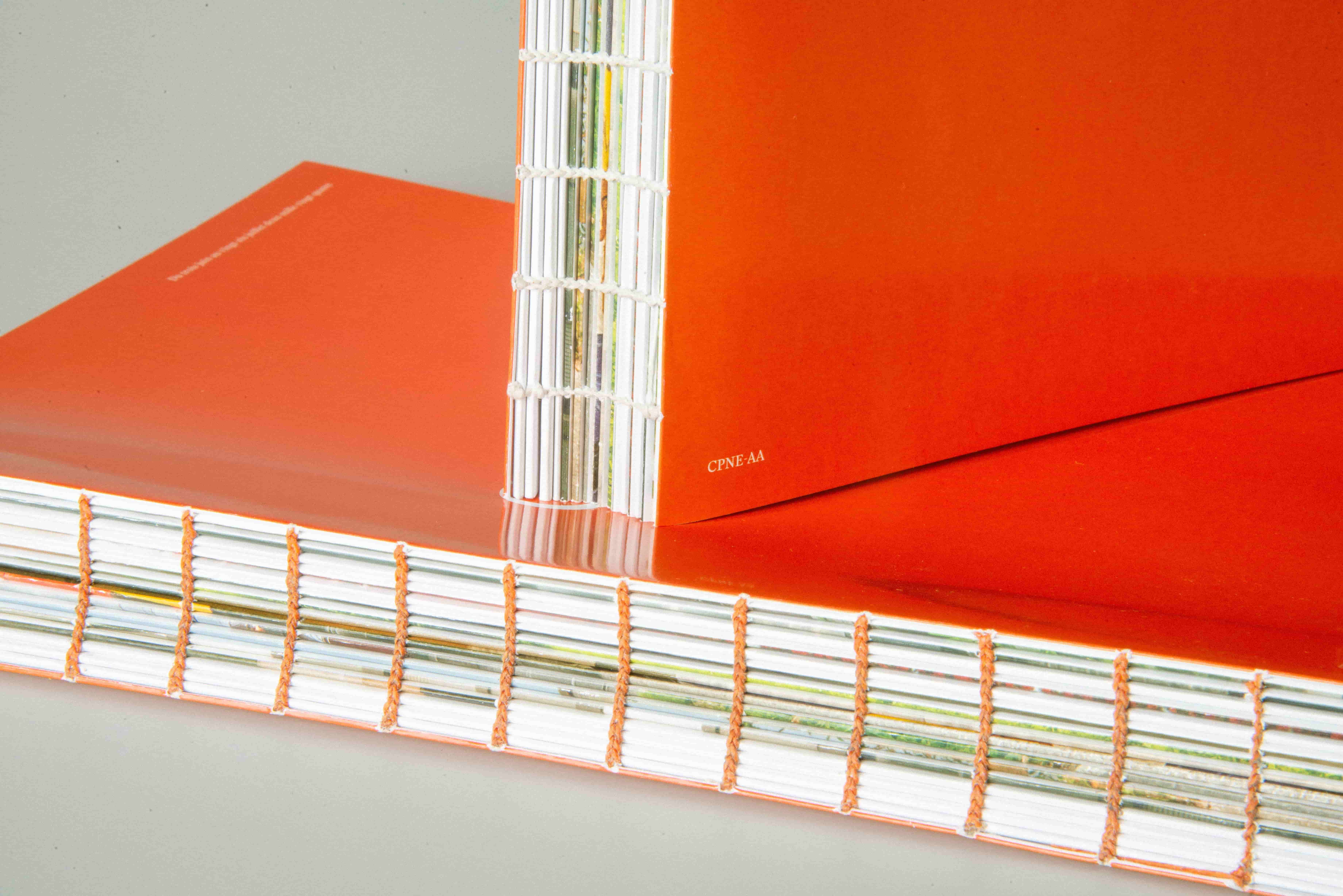
Object
The final piece is hand-bound using a Coptic binding. More than just a book, this report is the materialization of an intense and essential experience—a vibrant object that conveys just how formative and unforgettable this internship was.